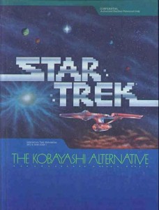
 As a Star Trek fan growing up in the ’80s, I didn’t get a lot of love in my youth as far as video games were concerned. When I was very young, I got to play the Star Trek Bridge Simulator for the Atari 2600. By the mid-’80s, I got my first computer, an Apple IIc. When I heard that there were Star Trek games for the Apple, my heart leaped! Until, that is, I got my hands on Star Trek: The Kobayashi Alternative.
This game was so insanely annoying that words fail. The game was one of the many RPGs of the time that was completely text-based and mind-numbing enough to make even the most mild-mannered of folk leap into expletive-filled rants! The idea for the game was sound enough and designed to literally put you in the command chair of the U.S.S. Enterprise. The problem is that the commands that you needed to give had to be so specific that you would literally spend half your time being told you don’t know what you’re talking about.
Around this time, my father signed me up for this service that sent me a floppy disc a month. On this disc was a small set of rinky-dink software meant to keep you busy. Some of it was great (like the Beatles trivia game), some of it not so much. Buried on one of the discs was a game called Space Trek. Now not being the completely dim bulb that many might think I would be (and you know who you are), I immediately recognized that this could be somehow related to Star Trek (albeit not quite sanctioned).
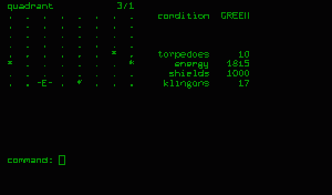
A ‘screenshot’ of a version of the classic early computer game Star Trek, written by James Gibbon in C.
The game was a simple one. As the U.S.S. Enterprise (represented by the letter E), you had to navigate from sector to sector, defending starbases from Klingon and Romulan attacks with your phasers and photon torpedoes. You’d get updates on damage to yourself and the enemies as well as torpedo counts. Occasionally you’d have to dock with a base to refuel and repair. It was a really fun game given it’s very simple interface (imagine all graphics done using ASCII).
After a few years, I discarded my Apple IIc and Space Trek, unfortunately, with it.
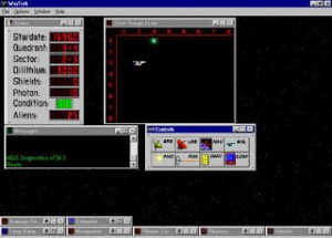
WinTrek in all it’s multi-windowed glory!
In the mid-90’s, I discovered Win Trek, which was simply an updated version of the game with a few Star Trek sound effects and stills added for good measure. The general interface was the same, however, as well as the controls. This game was primarily for Windows 95 and so by the mid 2000’s, it became too primitive to really play anymore.
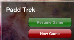 This week, like a bolt out of the blue, I stumbled onto Padd Trek, an IOS game based WHOLLY on the original Star Trek text game, but super-amped for the 21st century. While the game has dropped any and all pretense of being a Star Trek game anymore (gone are any and all references), the game play is still there, with a few extras added for good measure!
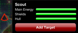 The game gives you the choice of EASY, MEDIUM or HARD. So far, I’ve only been able to play the game even remotely well on EASY. You’re battling against three different kinds of enemy vessels. The first is the SCOUT, which is the easiest to destroy. It’s represented by a slightly rounded red triangle. Depending on its range from you, a single “laser” strike could take it down.

The second ship is a CRUISER. This ship, rather paradoxically, more closely resembles the Starfleet Delta insignia from Star Trek (which would almost lead you to believe that these are the good guys). This ship is a bit harder to destroy and may take up to three laser blasts to destroy. A great addition to this game is that your distance from the enemy ship will affect your laser’s effectiveness. The closer you are, the stronger your blast.
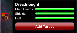 The final ship is the DREADNOUGHT. To me, and I’m sure you’ll agree, this ship looks just like a Borg cube and, believe me, it’s just about as difficult to destroy. You’ll have to dedicate no less than 4 of your torpedoes to taking this bad boy down. And one strike from their ship will almost completely drain your shields, so be careful!
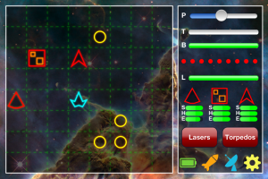
As you can see, the overall look of the display hasn’t changed much from the original. It’s just gotten a whole ton of bells and whistles. Like the earlier versions, if a star (a yellow circle) is between you and your target, you won’t be able to hit the enemy with a torpedo. Instead it will go into the star. Your lasers are still effective, however. Unlike the original games, however, you do have a few extra options to keep you going. For example, in this game you can target up to three ships in one turn (or one ship 3 times, or any combination thereof). You can also set your laser strength, but be careful. The stronger the blast, the hotter it will run. You can burn out your lasers.
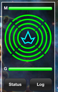 Your shields are distributed among the four sections of your ship. At the top, you have a meter that shows the overall energy left on the ship. If your shields are depleted due to enemy fire, you can divert energy back to the shields. Conversely, if you’re low on energy, you can divert power back from the shields, but of course you need to be careful. Once you run out of energy, that’s about all she wrote.
At the bottom of the screen you’ll see a STATUS button which will allow you to access a status report screen of all the ship’s systems. From here you can choose to make repairs or skip a turn if necessary. Also on this screen is the all-important SELF-DESTRUCT button. A far cry from the 4-prong access system aboard the Starship Enterprise, it’s still plenty effective. Self-destructing will take out all the ships in the sector, but of course also ends the game. The LOG button is a throwback to the original version of the game, giving you text statistics of all the damage that you’re doing in a fight.
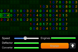 The long-range sensors and navigation come right from the original game set-up. Each sector is represented by 3 numbers. The first number, in red, shows how many enemy ships are in the sector. The second (in blue) shows you how many starbases are there. The third, in yellow, shows how many stars. On this screen you can also set your speed and check engine, deflector and energy converter status (the converter helps you reenergize your systems while you go instead of having to constantly dock to get your energy back up).
 But the biggest improvement to this game over the original is the minor touch of actually having a warp-speed screen show up as you travel from one sector to the next. The star-streak effect looks like it’s right out of Star Trek: The Next Generation (or at least a decent Windows screen saver near you).
While this game doesn’t make any sort of creative use of the iPhone’s retina display and while doesn’t have any multiplayer options, it does very nicely update a classic computer game in a way to make it fun to play on your iOS device if you’ve got some time to kill. Hell, pop on your favorite Star Trek score on the iPod while playing, and you can really add to the experience nicely.
Would it be nice if the good folks at CBS Interactive finally got on board and made this an official Star Trek game? CERTAINLY. But you know what? Much like those halcyon Apple IIc days, all you need is a little imagination and you can MAKE IT SO!
You can pick up PADD TREK in the iTunes store for your iOS device. You know what? It’s FREE!